
BACKGROUND
WHAT
Conceptual case study as part of the CareerFoundry UX program
TIMELINE
Dec 2022 – Mar 2023
ROLE
Sole UX/UI designer
TOOLS
Figma, Miro, Optimal Workshop, UsabilityHub, Google Forms
PROBLEM STATEMENT
Dining out with a group of friends should be a joyful occasion. But when it comes to splitting the check, a pleasant evening can end with confusing calculations, anxiety over unspoken agreements or even hurt feelings.
Dining out with a group of friends should be a joyful occasion. But when it comes to splitting the check, a pleasant evening can end with confusing calculations, anxiety over unspoken agreements or even hurt feelings.
HYPOTHESIS
An app that allows people to easily divide expenses and pay for their own share on the spot will take the stress out of splitting bills and let people focus on enjoying the time with their friends.
An app that allows people to easily divide expenses and pay for their own share on the spot will take the stress out of splitting bills and let people focus on enjoying the time with their friends.
RESEARCH
Survey
I surveyed 70 people aged 18-45 and located in the US who dine out with friends at least once a month. I asked how they typically split bills at restaurants and how they pay back the person who picked up the bill.
67%
split the bill so that everybody pays just for what they had.
77%
pay back their friends for the meal via a peer-to-peer payment app.

For 61%
this is the context in which they most frequently use such apps.
Interviews

To dig deeper into the emotional side of bill splitting, I interviewed five individuals aged 29-35 who either live in the US or used to live there for several years.
I asked questions about:
their experiences with bill-splitting at restaurants
their usage of peer-to-peer payment apps
how they feel about the security of those apps
I asked questions about:
their experiences with bill-splitting at restaurants
their usage of peer-to-peer payment apps
how they feel about the security of those apps
INSIGHTS
Subjects across the board feel that Venmo (the dominant payment app in the US) simplifies the bill-splitting process.
Still, when they describe this process, they paint a rather disorganized picture: people scramble to take a look at the bill and to get the payer’s Venmo info. The whole process feels slow and disruptive.


Handling money in social situations can evoke a host of negative feelings. Subjects feel frustrated, awkward, and acutely aware of their own and others’ actions. They are also wary of giving out information that they feel should remain private.
POINT OF VIEW
User persona
Drawing on insights from the surveys and interviews, I created a user persona that captures the attitudes, goals, and pain points of the typical user. For the rest of the design process, this persona served as a memorable reference.

Persona
IDEATION
The ideation phase was focused on coming up with solutions for the pain points discovered during research. The outcome was a first prototype of a payment app that includes a collaborative bill splitting feature. Early on, I decided to call this app Gather.
Journey Map
To generate ideas for the bill splitting feature, I envisioned what an ideal user experience for our persona could look like. I translated this into a journey map, visualizing the steps and interactions involved.

Journey map
Solutions for pain points
PAIN POINT:
WASTING TIME
PAIN POINT:
WASTING TIME
Manually splitting the bill often is a slow and disorganized process: passing around the bill and calculating who owes what is time-consuming and leads to inaccuracy.
PAIN POINT:
FEELING UNCOMFORTABLE
There’s no fixed way of splitting the bill: the logistics need to be decided on the spot. But discussing money with people is inherently stressful, so this can create an uncomfortable situation.

SOLUTION:
COLLABORATIVE
BILL SPLITTING
One person takes a picture of the bill, which is automatically processed into an itemized list. Then the collaborative bill splitting session starts: people select on their own phone what they had. This is fast, because everybody gets to enter their data at the same time.

PAIN POINT:
TOUGH MATH
Let’s say you are a group of five and you share two appetizers between all of you. Three of you also get a shared dessert at the end. One of you doesn’t drink alcohol, but the rest share a bottle of wine. All of this plus regular mains and figuring out tip and tax. Anybody care to do the math?
SOLUTION:
GATHER DOES THE MATH
Users only need to select what they had and what percentage they want to tip. Dishes can be shared between any subset of users in the session. The app does all calculations.
CONCERN:
WHAT IF MY FRIENDS
AREN’T ON THE APP?
Interview participants felt hesitant about installing a new payment app. This is because, normally, how useful an app is will depend on how many of the user’s friends have signed up as well.
SOLUTION:
JOINING WITHOUT
ACCOUNT
SOLUTION:
JOINING WITHOUT
ACCOUNT
Gather’s bill splitting feature doesn’t require an account. People who haven’t signed up can still participate in a bill splitting session. Rather than paying on the spot, they receive a payment request via SMS.

User Flows
Using the journey map as a guide, I developed more detailed and adaptable user flows that can handle different scenarios and edge cases.
Example flow: Splitting the bill as a payer
Example flow: Splitting the bill as a payer
In a bill splitting session there are two different user roles: the payer and the joiner. The payer is the person who starts the bill splitting session, invites the others, and pays for the bill. There can be only one payer per session. Everyone who joins the bill splitting session and is not the payer is a joiner.

Example user flow
SOME EDGE CASES
SOME EDGE CASES
ISSUE
An item remains unaccounted for.
OR
After confirming their items, someone notices that they forgot something.
SOLUTION
The payer can still make changes for others before paying.
AND
While data entry is still in progress, joiners can go back and make changes for themselves.

ISSUE
Someone encounters a problem during the session.
SOLUTION
The payer can finish entering this person's data and they get a payment request via SMS.
Information Architecture
To better understand how users categorize and prioritize the individual features of Gather, I created a sitemap, which I tested and refined based on the results of card sorting sessions with seven people.

Card sorting similarity matrix

Sitemap after card sorting
Sitemap after card sorting
PROTOTYPING
Low & mid-fidelity wireframes
I started with pen and paper sketches of the main features and iteratively refined them into mid-fidelity wireframes. Eventually I produced a clickable prototype in Figma, which I used for usability testing.


Examples of lo-fi and mid-fi wireframes
TESTING
Usability tests

To test the main features of Gather, I ran moderated usability tests with six participants who had no prior knowledge of the app.
The aim was to observe:
how willing participants are to comply with the permissions required during onboarding,
if participants understand the collaborative bill splitting process,
how easily participants navigate the key features of the app.
Participants were instructed to carry out three scenario tasks on a mobile phone running the prototype:
signing up for an account and sending money to a friend,
running a bill splitting session in the role of the payer,
participating in a bill splitting session in the role of a joiner.
To classify and prioritize the observations made during the tests, I used affinity mapping, a rainbow sheet and an error severity scale. The five most pressing issues were addressed in the next iteration of the prototype.
Examples of discovered issues
Examples of discovered issues
Issue 1: Calculations aren’t transparent
There’s no way for users to track the automatic bill split calculation, because not all intermediate steps get displayed.
EVIDENCE
One participant wrongly assumed that by selecting an item, he’d commit to paying for this item fully, even though it had been selected by other people as well (and hence should be shared).
Another participant wanted to check if the calculations are correct. He couldn’t, because not all intermediate steps are shown.
CHANGES
Once an item gets selected, additionally display the share that the user will have to pay for that item.
Add a screen containing a complete breakdown of the calculation, which can be accessed from the item selection screen and, after a split is finalized, from the transaction history


The new version displays the user’s share for each selected item in an accent color and has a modal that shows the full split breakdown.
Issue 2: Payment options
The different options for paying at a restaurant are hard to understand.
EVIDENCE
None of the participants understood immediately what the two available options amount to; one user even missed the second option completely and consequently assumed that it’s impossible to split a bill with Gather when paying in cash.
CHANGES
The originally offered default option was to “digitally pool money”, which is a novel and therefore hard to grasp concept; this option was revised to a more familiar procedure: one user pays the total, then (automatically) gets reimbursed.
I rewrote the copy on the payment-selection screen and reorganized the information.

Issue 1: Calculations aren’t transparent
There’s no way for users to track the automatic bill split calculation, because not all intermediate steps get displayed.
EVIDENCE
One participant wrongly assumed that by selecting an item, he’d commit to paying for this item fully, even though it had been selected by other people as well (and hence should be shared).
Another participant wanted to check if the calculations are correct. He couldn’t, because not all intermediate steps are shown.
CHANGES
Once an item gets selected, additionally display the share that the user will have to pay for that item.
Add a screen containing a complete breakdown of the calculation, which can be accessed from the item selection screen and, after a split is finalized, from the transaction history
The new version displays the user’s share for each selected item in an accent color and has a modal that shows the full split breakdown.
Issue 2: Payment options
The different options for paying at a restaurant are hard to understand.
EVIDENCE
None of the participants understood immediately what the two available options amount to; one user even missed the second option completely and consequently assumed that it’s impossible to split a bill with Gather when paying in cash.
CHANGES
The originally offered default option was to “digitally pool money”, which is a novel and therefore hard to grasp concept; this option was revised to a more familiar procedure: one user pays the total, then (automatically) gets reimbursed.
I rewrote the copy on the payment-selection screen and reorganized the information.
ITERATING
Evolution of a Screen
DESIRED OUTCOME
A screen where everybody can enter on their own phone what they ate and drank and how much they want to tip
DESIRED OUTCOME
A screen where everybody can enter on their own phone what they ate and drank and how much they want to tip

Required features
Even if there is just one of an item, people can share it (e.g. several people share a starter).
Users can select more than one instance of an item (e.g., someone had several beers).
Items can be shared between users unevenly (e.g., someone had two thirds of a dessert, someone else the remaining one third).
Users see feedback:
when they select an item
how many of an item they have selected
who has selected an item
The view auto-updates in real time, so that everybody can see what the others have already selected.
The total and tip are calculated automatically and updated in real time as well.
The payer can enter data for themselves and for others.
A useful new concept
Here’s a concept that lots of people are familiar with from online shopping: adding an item. An item typically gets added to a shopping cart.
But for collaborative bill splitting, we need a slightly different concept, namely adding oneself to an item.
What does this mean? Imagine I had a red curry. I add myself to this curry. I didn't share the dish, so I'm the only person on it and pay for it completely:
Red curry:

Let’s say I also shared spring rolls with two other people. So each of us adds themselves to that dish. We split the price: each of us pays one third.
Spring rolls:


If I wanted to pay more than one third, I could add myself to the spring rolls again. Then I would pay half, and my friends would each pay one quarter.
Spring rolls:

A useful new concept
Here’s a concept that lots of people are familiar with from online shopping: adding an item. An item typically gets added to a shopping cart.
But for collaborative bill splitting, we need a slightly different concept, namely adding oneself to an item.
What does this mean? Imagine I had a red curry. I add myself to this curry. I didn't share the dish, so I'm the only person on it and pay for it completely:
Red curry:
Let’s say I also shared spring rolls with two other people. So each of us adds themselves to that dish. We split the price: each of us pays one third.
Spring rolls:
If I wanted to pay more than one third, I could add myself to the spring rolls again. Then I would pay half, and my friends would each pay one quarter.
Spring rolls:
Using this concept, what could a screen look like that satisfies all of our requirements?
Using this concept, what could a screen look like that satisfies all of our requirements?
V1


V2 CHANGES
Persistent +/– buttons (before: + button appearing only when an item is highlighted).
Placement of +/– buttons on the right side, because on the left they could easily be mistaken for buttons that increase the number of the respective item listed on the bill.
Sticky card at the bottom to show the total even when item list exceeds the screen.

V3 CHANGES
To address issues that emerged during testing, more information has been added to the screen: for each item that a user selects, they now see the share they are paying for this item.

V4 CHANGES
Input chips now contain a trailing X icon to directly remove the chip.
This also opened up a way to simplify interactions. The user can remove themselves from an item by removing their chip. The – button isn't needed.
The + button is left out too. The user can add themselves by tapping a list item.

V5 CHANGES
Uses a second accent color, which helps to set off highlighted items and links.
VISUAL DESIGN
I received feedback from my peers and my mentor, which I used to further revise my design. This last round included everything from more significant changes to the onboarding flow to small visual tweaks. I also evaluated the app’s accessibility and made several changes to meet AA standards, increasing touch targets, fonts and contrasts.

Style guide
Finally, I compiled a style guide, to help maintain consistency and coherence throughout the interface.


FINAL PROTOTYPE
Sign up & permissions
2-factor authentication during sign up to register a new device.
A slide show introduces the key features.

Permission priming is used throughout the onboarding process.
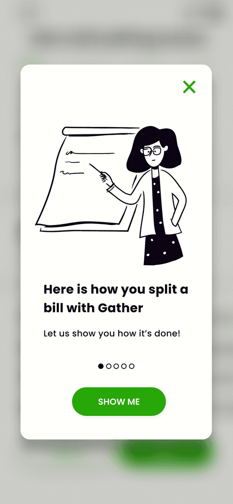
FIRST-TIME USER EXPERIENCE

Onboarding is progressive. First-time users get to see short tutorials and coach marks at relevant points.
STARTING A BILL SPLITTING SESSION

To start a session, a user first invites contacts. While these contacts are accepting the invitation, the user has time to scan the bill.

SELECTING ITEMS

Everybody selects items at the same time and can see what the others have selected.
AUTOMATIC CALCULATIONS
Gather automatically adds tips and taxes. If desired, a detailed breakdown of the calculation is available.

gather
A payment app that lets you split restaurant bills together


LEARNINGS & TAKE-AWAYS
This project was part of my CareerFoundry curriculum and the beginning of my career change. It helped me practice essential UX skills in all phases of the design process: user research, information architecture, wireframing, usability testing, and UI design. And along the way I learned Figma too!

At first, the most challenging aspect was moving from a functional understanding of what a screen should do to the visual design of that screen. But as I gained more experience with UI patterns, I found it became much easier to translate abstract requirements into UI elements—and now this is one of my favorite parts of the process!
I was really impressed by the empirical approach used in human-centered design. This approach focuses on the needs of users and uses different research methods to find out what those needs are and if they are being met. I was happy to learn that qualitative, observational data—and not only quantitative ones—play a big part in the research process. As I got to experience, they can reveal important insights about users' behaviors and experiences, which in turn can be used to improve the product.
